Showing posts with label Photo Editing Tutorial. Show all posts

Monday, November 10, 2008

How to Use Photo Masks

How to Use Photo Masks in Photoshop Elements
by Julie Ann Shahin, Founder
Close-up of photo in layout
******************************
Final Layout. Credits: Nessa Kit by Erica Hite. Photo Masks Canvas by Amanda Sok. All available at Scrapgirls.com
*********************
Here is a simple technique to add texture and interest to your photos. The final result is posted above. For this example I am using {canvas} photo masks by Amanda Sok available at Scrapgirls.

The instructions for using these masks are very simple.
Step 1. Open your photo in PSE.
Step 2. Select the photo mask you wish to use, and open it in PSE.
Step 3. Drag the photo onto the photo mask so that it is the layer above the photo mask.
Step 4. Select ctrl+g to clip it together.
Step 5. To use it in a layout, select Layer--> Merge Visible.
Step 6. Drag the photo onto your layout.

Here are some looks that can be made with Amanda's photo masks.


Please leave feedback if you would like more new content on the EDS Blog!

Julie Ann Shahin, Founder

Tuesday, October 02, 2007

Day 2 Of Birthday Bash

Free Kit Available At The End of the Week in Our Newsletter

EDS Birthday Blog Party Day 2

Thank you to the following EDS Friends who left a link to their blog.
Please take a moment to check out their blogs, mingle like good party guests, and leave a friendly hello!

colleen
kelli
yezenia
cindy
juls
brooke
aimeslee
bucket
cpbunch
maggie
di
beth
julie k

Join us all week as we celebrate our first ever birthday. Add to our party by linking your blog in our comments section.

The 50th person this week to add a link to their hybrid or digital tutorial will receive an extra special RAK.
Please add your link in our comments section. At the end of the week one of these persons will be awarded the title of Guest CT member for the EDS Blog for November, December and January!

Be sure to party and mingle with all those linking our blogs.
My niece just turned 14 in September.
Layout created with the EDS Blog Birthday Kit - free to all newsletter subscribers.
Newsletter will be sent on October 7th.
Credits: Template: Michele Ciola for EDS Blog
Blue paper, bird sticker: Julie Kelley for EDS Blog
Other papers: Di Hickman for EDS Blog
Button: Maggie Lamarre for EDS Blog
Alphabet: Julie Ann Shahin for EDS Blog
Font not included in kit: AMC Chatty available at Scrapgirls


Now we will share a new birthday-themed tutorial for all our party guests!
************


Digital Scrapbooking Tutorial by Maggie Lamarre, Creative Team Member
Using the EDS Blog Birthday Kit

Hi Everyone:
I have been trying to figure out what every single options in PS does and have discovered some great tricks.

Today I will go over vector mask and match color mode and what they do, and how you can use them to improve your pictures.

  • Vector mask are great for defining images and it is sharper than using layer mask.
  • Match Color is used to match colors between several layers. I mainly use it to tweak the colours in my image precisely to a colour I have in mind. It is also great for correcting colour cast or to add luminance to a picture.

Let’s begin
  • Open an image in my case I wanted to mask my pool screen enclosure and have the flower really pop only in certain areas and have a greater depth of field.


1.make a copy of the image, then select image, mode turn the picture into grayscale.
2.convert the image back into RGB.

3. paste the other copy onto the layer so now you should have a grayscale layer
and colour layer.

3.Now on the colour layer selected we are going to choose Vector Mask under
Layer select reveal all.
4.Now you should see the mask on the layer.
5.Select the gradient tool from the tool menu and select transparent or black depending on how much you want to mask, and apply.

Here’s where the fun really begins


6.on the layer with the mask, select image adjustment and select match color.

7.Now if the image has an unnatural colour cast you can click on the neutralize and adjust to your liking.

8.We are going to play with the colours a bit here, make sure preview is selected.

9.On the slider for color intensity slide to the right to pop to tone it down slide to the left.

10.if too much colour you can adjust the fade which works similar to the fill option in the layer palette.

11.As this point you can adjust the luminance as well and it ok, if you want more pop like I did on this pic I use the burn tool, once satisfied I turned the layers into a smart object and save.


Have fun create your ART,
Maggie Lamarre


Please join our party!!!

Friday, June 01, 2007

How To Use Free Software GIMP to Brighten Photographs


Using Levels to Brighten a Photo in GIMP (Gnu Image

Manipulation Program)

by Angela Spangler, Creative Team Member


We all have those photos that could us a little brightening. Levels is an easy way to bring up the tones in an image.

Here's an image I took that is just a tad dark.


Now, I'll brighten the photo using Levels.
In GIMP, things are similar to Photoshop.

Click on Tools > Color Tools > Levels


Now, move the middle triangular slider over to the left a bit and see what it does to the photo. You will need to experiment with this part to get the desired effect.


It's that easy! If needed, you can add a bit of contrast to the photo by going to Tools > Color Tools > Brightness/Contrast.


GIMP is free. You can download GIMP at http://gimp-win.sourceforge.net/ (Windows).


Please leave feedback for Angela! We work hard to bring you free tutorials. :)

Support This Site

Thursday, May 31, 2007

Proven Tools for Great Composition


Tips for Cropping and Re-sizing Photographs

by Julie Ann Shahin, Founder

As posted on the blog at stock.xchng - Do you often wonder when you should crop or move or rotate a pic and what about the composition ? You can download for free geometrical guides from that blog to use when cropping a photo.
When do we use these Guides ?

1 To check a composition.- To check easily
whether the subject is actually in the center of interest and to see if there is
a relation among its elements.

2.- When we are reframing a picture . Sometimes
it is difficult to know what the composition will be at the time of shoting so
if we take a wide shot , then we can edit it , using these formats to create the
composition and know exactly where to crop move or rotate ,following a
geometrical pattern that will make our pic more interesting !Paulo Porta

In the following tutorial, I am using the guides after installing them into my custom shape library. If you click on the blog link above, you can download for FREE these guides too, as well as see additional tutorials. Here is my tutorial for cropping a photo and putting it into a quick page layout. This tutorial assumes you have followed the directions for installing the custom shape tool geometrical guides.

1. Open your photograph that you wish to use.


2. Click on your shape tool, then in the drop-down menu, select Geometrical Guides.


3. I am going to use the 3x2goldenguides which is the second from the left. This tool is based on the golden ratio and derivatives.


4. Click on your picture, hold down the shift key to maintain proportion, and drag the mouse to create your rectangle. Use the arrow keys on your keyboard to move the rectangular guide into place.


5. When you are satisfied with the size and placement, click the green check mark to confirm.


Support This Site


6. Here is my cropped photo.


7. I decide I want to get closer in so I undo that crop by going to Edit-->Undo (ctrl+z) and then re-size my guide by using the move tool. You can drag the corners to re-size. Use the arrow keys on your keyboard to move the guides. When you are happy with the change in size, click the green check to confirm.


8. Now here is the final crop that I will use in my layout.


9. After applying a photo action to brighten the colors, I drag my photo and the guide onto a quick page. Rotate the photo using the move tool and swinging the corner around. Do the same for your guide.


10. Since the opening for the photo in this page is a square instead of a rectangle, I make sure my photo and my guide are centered.


Here is my final layout featuring Michelle Underwood's Rock the Rainbow Quickpage. Be sure to check out my mini-album for sale using Michelle's Rock the Rainbow kit at Scrapquick.com!


Please leave feedback! thank you!!!

Credits:
Geometrical guides: stock.xchng
Quick page: Michelle Underwood Rock the Rainbow
Chalked edge: Jan Crowley Little Black Dress kit
Circle stitches: Jessica Bolton
Other stitches: Michelle Underwood
Font: Myriad Condensed


Wednesday, May 30, 2007

How to Use Your Software to Manipulate a New Look for Your Photo

Note: Subscribe to Scrapbook Dimensions Magazine by June 1st and receive the free digital kit b y Carrie Stephens! The kit will be GONE after June 1st!!!


Digital Photography Tricks

by bucket aka Susan Rodriguez

(especially cool for Halloween!)

For this tutorial I thought I would do something a little different and fun. I am not the best photographer but I do have to say I love poking fun at my photos. Have you ever gone to a carnival or an amusement park and had someone draw your picture but it never quite resembled you at all? This tutorial will show you how to create a fun look out of your digital photographs.

Below is my original photograph.


We will be using a liquefying filter to create a fun looking photo. Click on Filter -> Liquefy. Below I have selected the tools I will be using in this tutorial.


Around the eyes I used the bloat tool. I adjusted the brush size just big enough to fit around the eyes. I then took the forward warp tool and just dragged it up above the eyebrows a bit. I also used the forward warp tool on the noses just to make them a bit pointy. ** Note** if at any time you feel that you want to undo anything you can use the reconstruct tool located right underneath the forward warp tool. Continue playing with the different tools to get the look you are looking for. Below is my almost completed drawing. Pretty scary looking isn’t it.


For a different look I decided to give the picture a glowing edge filter. Create a duplicate layer (Ctrl-A, Ctrl-C, Ctrl-V) and click on Filter -> Stylize -> Glowing Edges.

To make this picture more fun I added a color burn blending mode. To do this right click on the duplicate layer, Blending Options, drill down on blend mode and select color burn. Play around with the opacity until you get the look you are looking for.


Below is my final project, it’s something fun and different to do with your photographs. Hope you enjoyed it


Please leave feedback for Susan! Thanks!


Support This Site


Tuesday, May 29, 2007

Digital Photography Tricks in Photoshop Day 2

Removing Things from Photos in PSE5

by Beth Price, Creative Team Member


I have a shot of my daughter at the park, and its not the best shot in the world. But there is a story to go with the photo, so I decide to use it anyway. However, I want to remove a couple things that distract me from the focal point. Here is how I do it in Photoshop Elements 5.

  • The original photo has some problems that bug me – there is a trash can in her line of view, and there is a pole sticking out of her head.
  • I don’t really like the cars either, but if I clean up the other things, maybe they won’t bother me too much.


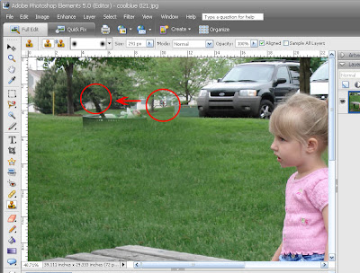
So the easiest thing I can do is remove the trash. For this one, since it’s mostly surrounded by the grass, I’m going to use my clone stamp. I click on an area that represents what I want to fill with, and then start painting over the trash can with my mouse. Do lots of short strokes because if you mess up, you can undo just that step and not have to start again from the beginning.


When I have removed the part of the trash can that is surrounded by grass, I am left with the more difficult area on top that is near the trees and houses. Now I’m going to take some creative license and just try to blend the background, not worry about making it look like the real thing. So first I use the clone tool and alt+click to the right of the trash can, on the trees and window. I try to select a brush size that matches the object I’m getting rid of, so that I only have to click once over it.


When I’ve finished this part my edited area will have more trees and more windows, but hopefully, no one will be looking closely enough to realize I did some remodeling.

In the next frame, I saw that my grass line looked pretty messed up after cloning the trees and windows, so I again just clicked on the grass line near the single tree on the left, then cloned that area in short strokes to make a new grass line. Again – its not the same as the original, but as long as I can get it to look simple and even, I don’t think anyone will be distracted by it.


Next I’m going to take the pole out of my sweet girls head. This is messy so I’m going to work in very small chunks, in a very zoomed in area.

My first step is to select the area in front of the white van. I use the polygonal lasso tool to outline the area as closely as I can. When I’ve selected the area and get a tiny little circle sign, the area turns to blinking dash marks (marching ants) and I can then start cloning in the white from the other part of the van. Using a selected area is just a simple way to define the area to be removed, and prevents me from erasing the stuff next to it that I need to remain there. We’ll fine tune in just a minute.


The next figure shows that I selected the clone tool, and I’m filling in the lassoed area.


Now I’ll fine tune this area, because my edges are pretty sharp and don’t blend well in the picture. So I select the >Blur Filter>Radial Blur to soften the edges. I still have the area selected/lassoed. Now I will adjust the amount of blurring so that it blends better.


I continue to work on small sections of the pole. Now I’m going to go back to my clone stamp, and Alt click on an area just above the pole, and try to continue to line of the windshield down to the van.


Then I try to clone the SUV window. Since this is a dark image, I stand a pretty good chance of faking it, and carrying the window over the pole. I just play around with the clone stamp until I get a good approximation of what is there. The thing that helps cloning is playing around with the brush size. Try to use a brush size that is as close to the size of the object being erased as possible, so that you don’t have to do it in lots of sections.


Then I try to clone the SUV window. Since this is a dark image, I stand a pretty good chance of faking it, and carrying the window over the pole. I just play around with the clone stamp until I get a good approximation of what is there. The thing that helps cloning is playing around with the brush size. Try to use a brush size that is as close to the size of the object being erased as possible, so that you don’t have to do it in lots of sections.


After I get the pole removed from the SUV, I’m done with the hard part. When I move out or zoom out, the photo really looks pretty good. I can get away with this because I have a busy background with a lot of smaller objects going on. This looks better to me. So I can quit here, save the photo and do my page.


But since I’m here… why not save the photo then play around a little bit more…
So I select the blur tool and I’m going to reduce the impact of all those parked cars. The blur tool is represented by a water drop. It might not be shown in your tool bar, in which case look for the sharpen or smudge tool, and then change the effect.


I adjust the size of my brush to cover the vehicles and go over it a few times, until I feel the blur is not distracting but still diminishes the impact of the vehicles.


OK, I could go on playing, but you get the point. Have fun!

Here is the finished picture! Ready for my story.


Please give Beth feedback on her tips! Thanks!!!


Support This Site