How to Create Custom Color Swatches in Photoshop Elements

Visit our Sponsor: Jill D-Zines.

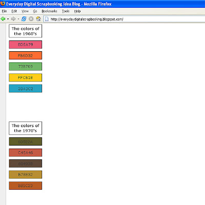
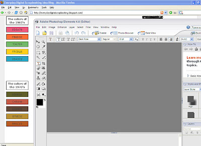
2. In PSE, click on Window --> Color Swatches. We want to make a new set of color swatches. You need to have room or a grey area after your last color. You can check this by scrolling down to the bottom color. If you do not have any room, or grey area, you will need to delete a few colors. To delete a color from the swatch, right-click on the color. Click on "delete color." When you have spaces, grey area, next to your last color, then you are able to add your own custom colors to create a brand new swatch.

3. To create a new color, double-click on the foreground color in your toolbar. Type in the color formula # as stated on the web page.
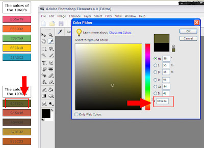 4. To enter this new color into the swatch, hover the mouse over the grey area after the last color. The mouse will turn into a paint bucket. Click once in the grey area.
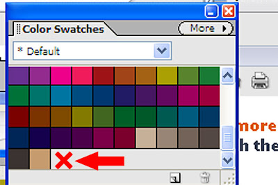
5. A box will pop up for you to enter a name for your custom color. You can give it any name you like. I typed in the formula for this color as my name.
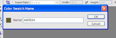
6. Click OK and your color will appear next to the last color that was previously there.
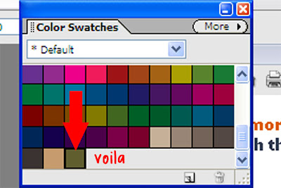
7. Repeat steps 3 -6 until all the colors you desire are entered. Next you will want to save this color swatch for future use. Click on the "More" tab.
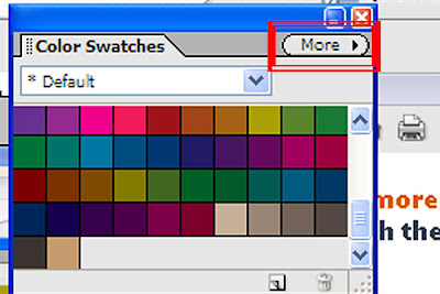
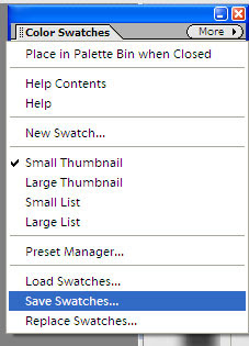
8. Click on "Save Swatches"
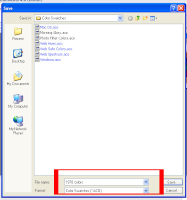
9. Enter the name you wish to give to this set of swatches. Click on "Save."
 10. Now you are set to create your digital pages. You may load your custom color swatch at any time. This is especially useful when creating a themed album where you want to co-ordinate the colors.
Credits:
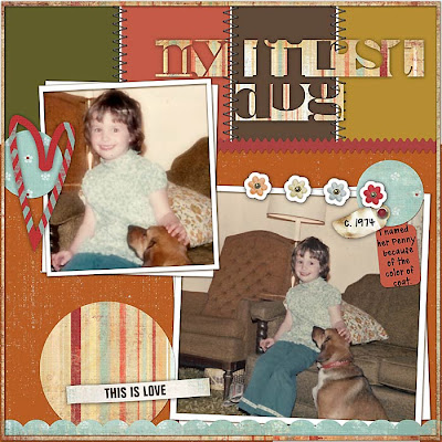
Layered template: Pajamas for Love Katherine Lent aka scrapyard kath
Kits: Jen Wilson Designs Rejenerate Collection (Rekindle, Reflect)
Fonts: TXT Annesia; Bodoblack Squares
If you liked this tutorial, you will enjoy our newsletter!
Color For Digital Scrapbooking Tutorial
by Julie Ann Shahin, Creative Team Member
by Julie Ann Shahin, Creative Team Member
This tutorial expands on the previous article about Color Schemes Based on the Age of Your Photo.
1. First, open the web page with the color formula. Then open Photoshop Elements. Click on the "Restore" icon in the uppermost right corner to have the PSE window smaller. Move the window to the right by holding down the mouse in the upper bar and moving to the right.
1. First, open the web page with the color formula. Then open Photoshop Elements. Click on the "Restore" icon in the uppermost right corner to have the PSE window smaller. Move the window to the right by holding down the mouse in the upper bar and moving to the right.


2. In PSE, click on Window --> Color Swatches. We want to make a new set of color swatches. You need to have room or a grey area after your last color. You can check this by scrolling down to the bottom color. If you do not have any room, or grey area, you will need to delete a few colors. To delete a color from the swatch, right-click on the color. Click on "delete color." When you have spaces, grey area, next to your last color, then you are able to add your own custom colors to create a brand new swatch.

3. To create a new color, double-click on the foreground color in your toolbar. Type in the color formula # as stated on the web page.
 4. To enter this new color into the swatch, hover the mouse over the grey area after the last color. The mouse will turn into a paint bucket. Click once in the grey area.
5. A box will pop up for you to enter a name for your custom color. You can give it any name you like. I typed in the formula for this color as my name.

6. Click OK and your color will appear next to the last color that was previously there.

7. Repeat steps 3 -6 until all the colors you desire are entered. Next you will want to save this color swatch for future use. Click on the "More" tab.

8. Click on "Save Swatches"

9. Enter the name you wish to give to this set of swatches. Click on "Save."
 10. Now you are set to create your digital pages. You may load your custom color swatch at any time. This is especially useful when creating a themed album where you want to co-ordinate the colors.
Credits:
Layered template: Pajamas for Love Katherine Lent aka scrapyard kath
Kits: Jen Wilson Designs Rejenerate Collection (Rekindle, Reflect)
Fonts: TXT Annesia; Bodoblack Squares
If you liked this tutorial, you will enjoy our newsletter!


