How to Use Word Art as a Focal Point in Your Scrapbook Designs
Congratulations to the New EDS Creative Team Members!
We have our original members:
Angela Spangler
Beth Price
Cammy Plummer
and myself
and welcoming to the team:
Amy Duquette
Julie Kelley
Maggie Lamarre
Sue Kristoff
and last but not least Susan Rodriguez!
There were a lot of entries that made this decision extremely difficut.
For this reason, we added Creative Team Guest positions that will last one month.
Congratulations to the following EDS Creative Team Guest Members:
Audrey Prolix
Becky Adams
Laura Hadfield
We continue our focus on Word Art with two more great layouts. Enjoy!
Update:
My bad: I owe a huge apology to Maggie as I keep calling her Maggie D. instead of Maggie Lamarre!!!!
Featured Reader: Deena Wuest
 Project posted with designer's permission
Please click to enlarge
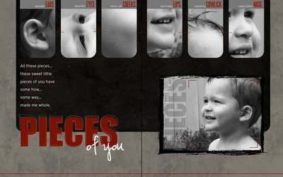
Layout Title:Pieces of you
Supply List:
SunPrints 2 by Katie Pertiet
Botanist No. 9 by Katie Pertiet
Stamped Blocks Brushes-n-Stamps by Katie Pertiet
Crop Marks Brushes-n-Stamps by Katie Pertiet
Sketch by Layout Blueprints
Impact, Interstate Light, Steelfish and Vaguely Repulsive Fonts
Journaling reads:
All these pieces...these sweet little pieces of you have some how...some
way... made me whole.
Technique:
To create the effect in my title, I typed out the word "Pieces" and changed
the color to a deep red. I then duplicated the title and changed the color
to white. In the Styles and Effects Palette, I selected Effects, then
clicked on Medium Outline (type). I drug the style on top of my title to get
the thin white outline you see. Next I reduced the opacity, slightly
enlarged it and put it on a minor tilt. I duplicated this layer once more,
using the same process.
 Project posted with designer's permission
We have our original members:
Angela Spangler
Beth Price
Cammy Plummer
and myself
and welcoming to the team:
Amy Duquette
Julie Kelley
Maggie Lamarre
Sue Kristoff
and last but not least Susan Rodriguez!
There were a lot of entries that made this decision extremely difficut.
For this reason, we added Creative Team Guest positions that will last one month.
Congratulations to the following EDS Creative Team Guest Members:
Audrey Prolix
Becky Adams
Laura Hadfield
We continue our focus on Word Art with two more great layouts. Enjoy!
Update:
My bad: I owe a huge apology to Maggie as I keep calling her Maggie D. instead of Maggie Lamarre!!!!
Featured Reader: Deena Wuest
 Project posted with designer's permission
Please click to enlarge
Layout Title:Pieces of you
Supply List:
SunPrints 2 by Katie Pertiet
Botanist No. 9 by Katie Pertiet
Stamped Blocks Brushes-n-Stamps by Katie Pertiet
Crop Marks Brushes-n-Stamps by Katie Pertiet
Sketch by Layout Blueprints
Impact, Interstate Light, Steelfish and Vaguely Repulsive Fonts
Journaling reads:
All these pieces...these sweet little pieces of you have some how...some
way... made me whole.
Technique:
To create the effect in my title, I typed out the word "Pieces" and changed
the color to a deep red. I then duplicated the title and changed the color
to white. In the Styles and Effects Palette, I selected Effects, then
clicked on Medium Outline (type). I drug the style on top of my title to get
the thin white outline you see. Next I reduced the opacity, slightly
enlarged it and put it on a minor tilt. I duplicated this layer once more,
using the same process.
 Project posted with designer's permission
 Please click to enlarge
Layout Title: 100% Boy 100% Mine
Supply List:
Black Paper: Botanist Notebook No 9 kit by Katie Pertiet
Blue Paper: Autumn Portrait kit by Jackie Eckles
Web Freebie Journaling Stamp by Katie Pertiet
Double Take Boy by Mary Ann Wise
Eurostile and Dirty Ego fonts
Comments:
To place my photo in the center of the "O", I first typed out the word "BOY"
and enlarged it to cover the span of my page. I then created a round-edged
square the same size as the "O" and in the layers palette moved it directly
under my large title. Above this layer, I added my photo and "clipped" it to
the square using the Ctrl+G command.
Be sure to sign up for the newsletter to receive a free Word Art download this week.
Additional Resources:
Quick lesson from digitalscrapbookplace on making custom word art
Make your journaling into word art - tutorial by Desiree McClellan -at 2peas
Changing the color of word art in Digital Image Pro tutorial at digital scrapbook place
Photoshop Text Tricks by Andrea Sampson at Scrap Outside the Box
Categories:
Adobe Photoshop
Create Your Own Elements
CS2
Custom
Designing with Fonts
Hybrid
Photoshop Elements PSE
PS7


4 comments:
Bonjour!!!
I'm very happy and honored!!!
Merci beaucoup!!!
{ThE fReNcH tOuCh}
http://prolix.typepad.fr
These two layouts are just awesome! Thank you so much for sharing them with us!
Congrats Amy D!!!! So proud of you girl!!!
Congratulations everyone! How fun!
(I can't believe I missed this cal. *doh!*)
Post a Comment