Tips for Designing with Text Paths
This week our goal is to bring you more design secrets: all about text! Check back all week for more tips and techniques.
Design Secrets: Text on a Path
Don't you just love when a layout comes together? Since scrapbooking is a highly personal hobby, I love to design layouts according to my tastes and style. You should do the same!Design Secrets: Text on a Path

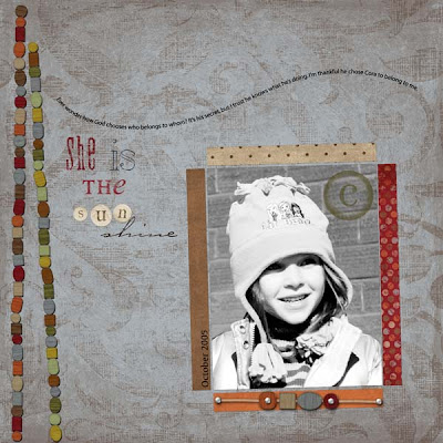
In this particular layout, I used the swirled text to flow across the page. Since the text ends above the photo, it draws the eye to the photo as you're reading.
- Experiment with different ways of placing your text, as it can be a unique embellishment to your layout.
- Have your text flow around the photo or
- along the edges of the layout.
Credits:
Paper, beads, Sun alpha from Fee Jardine's "Vintage Pickle" kit at www.thedigichick.com
"C" stamp from " Cherry Blossom kit at The Digi Chick
Text path: Jen Caputo at The Digi Shoppe
Fonts: DSP Pollyanna; OliJo; Carpenter; Will and Grace; Witchcraft
Related Tutorials:
Text on a Path in Photoshop CS
Text on a Spiral Path in Photoshop CS
Graffi's Video Tutorial: A quick and easy technique for making your text elements follow a line, circle, square, or any other path you can draw in Photoshop.
This is part 1 of a 5-part series on multi-use graphics created with Photoshop or Elements
If you feel inspired by today's tips, please leave a comment for our designer! Thank you.


1 comment:
i really enjoyed this tip today! i've been wanting to learn how to do this and here you've given me a tutorial to try out! thanks!
:) M
Post a Comment