Is there an official rule for the Magic Number 3 in Design?
The Magic Number 3 and the Visual Triangle
More Tips by Julie Kelley, Creative Team Member

More Tips by Julie Kelley, Creative Team Member

Whether you are talking about designing great scrapbook pages, or any other type of media for that matter, the rule of 3 and the visual triangle are really important to keep in mind. While I was researching to see if there was an "official" rule, I found a wonderful article about it. It is directly related to marketing and websites, but really explains the "rule" very well. It includes examples, and I think really translates well to scrapbook pages as well. Click here to read Visual Architecture: The Rule of Three
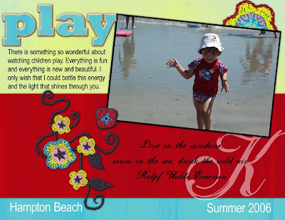
Here is the layout that I created in their image, using the principals and examples that they set out.

Credits:
Layout: Julie Kelley
Inspiration: Carole Guevin
Digital papers and elements: Berna Datema
Actions: Atomic Cupcake
Fonts: Rockwell Extra Bold, Arial Narrow, Selfish
If you were inspired by this week's tutorials, please leave our designers a comment! Thank you and have a great weekend.
Coming Next Week: Design Secrets of Text
Text on a Path, Spacing - Columns - Leading, Shaped Journaling, Formatting


2 comments:
Glad I came across your blog. Lots of great info here. Thx for sharing. I will be back!
i am really enjoying these posts; please keep up the good work!
:) M
Post a Comment