Wednesday's Tutorial
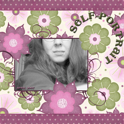
Have you ever created a layout, and you just can't stop looking at it? You're so pleased with how it came out, so you want to show it off to everyone you know. This layout was one of those for me, and there were a few techniques that I used that I think really make this layout work.

Technique #1: Portions of the background overlapping the photo
For this technique, you'll need a photo and a bold printed paper to use as a background.
- Open the paper as the first layer, then add your photo in a new layer.
- Copy the background to a new layer, and move it so it is on top of your photo. So, you should have 3 layers: paper, photo, paper.
- Adjust the opacity of the top layer so that you can see your photo through it.
- Move the photo around until you are happy with the location, then choose the background elements that you want to overlap your photo.
- Be sure that the top layer is active, then use the eraser tool to "uncover" the parts of your photo that you want to be visible, leaving the portions that you want to overlap the photo. Start with a large eraser size to erase large portions, then scale down to a smaller eraser size to get the details (in my example, cleaning up around the flower petals).
- When you are done, bump the opacity of the top layer back up to 100%.
Technique #2: Easy photo outlining
I wanted the photo to stand out a little bit from the background, so I had thought about putting some solid colored paper under it. Instead, I selected the photo and added a Stroke outline around it. I played with the pixel width and color until I was happy with the look. (In Photoshop PS2, right click on the layer and select Blending Options).
Technique #3: Circular Title
To create my title in a circular pattern around the flower,
- I selected the ellipse shape tool, and adjusted the settings so that it was drawn center first, and that it was a true circle.
- I also selected "Path Shapes" so that the shape that I drew would be a path element. I used the center of the flower as my circle center, then created the circle.
- I then switched to the Text Tool and clicked on the circle path where I wanted my title to start. The tool tip changes as you mouse over the path, so you know you've done it right.
- I entered the text, then adjusted the size until I was happy with the scale.
- I then selected Blending Options on the text, and selected "Bevel and Emboss" and "Drop Shadow" to give the title a raised look.
Layout Credits:
All paper and embellishments from our Sponsor Wacky Spring Kit by Kim Hill for CG Essentials http://www.cgessentials.com
Font: Cafe Rojo
Swirl Brushes: Cottage Arts Flourish Brushes Freebie (http://www.cottagearts.net)
If you feel inspired to go freestyle, please leave us a comment and let us know we inspired you! Thanks!!!


2 comments:
I just wanted to let you know that I enjoyed reading the blog and added you to my blogroll. I also recently wrote a post about digital scrapbooking and its marketability to teenagers that I thought you would find interesting. Thanks for creating a great blog! I'm sure I'll be back often for tips.
How fun! I can't wait to try this!!
Post a Comment