Step-by-Step Tutorial with Screenshots for Adjusting Leading
Design Secrets: Layouts Showcasing
the Use of Text with Leading, Spacing, Columns
by Cammy Plummer, Creative Team Member

the Use of Text with Leading, Spacing, Columns
by Cammy Plummer, Creative Team Member
Instructions:
1. Select background and layer elements in the following order, from the bottom up: paper square and torn paper strip, ribbon, note paper, photo, torn paper corner, tag, and tag embellishments.
Click on image to enlarge please

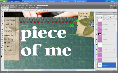
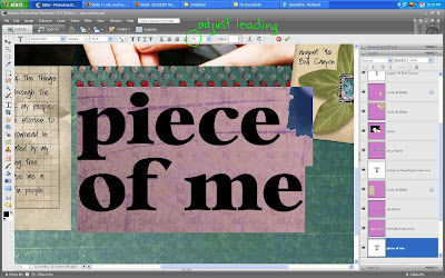
2. Add title. I usually set aside a specific space for my title, so I adjust the font size and leading (the space between lines) to fit.
Click on image to enlarge please

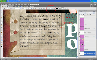
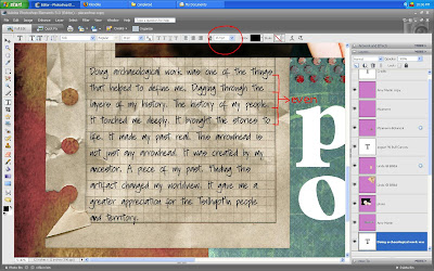
3. Write journaling in a font size that is appropriate for the space and font type. For a 12x12 layout, I do not recommend using a font size smaller than 12 point, unless you want your journaling to be difficult to read for the sake of privacy. Adjust the leading to fit the lines on your note paper. Note that you can use a decimal to get the leading right.
Click on image to enlarge please

4. Add drop shadows and the date and you are finished!

Credits:
Paper and leaf embellishment: MLamarre, The Botanical Collection, Oscraps
Note paper and tag: Linda Gil Billdal, Stationeries Revamped, Scrap Artist
Corner tear: Linda Gil Billdal, Cardboard Flip and Tear, Scrap Artist
Ribbon: Jen Wilson, Meaning 4, Jen Wilson Designs (stamped dots); Michelle
Underwood, Random Thoughts 3, Scrapbook-Bytes (measuring tape); Amy Martin,
Stitched Folded Bundle 1
Paper tear:Stephanie Krush, 2005-Straights, Digital Paper Tearing
Actions: Traci Murphy, Drop Shadows, Traci Murphy Designs
Fonts: Bambi Bold; Soli


No comments:
Post a Comment