Discover How to Create Journaling Columns In Photoshop Elements
Creating Columns for Journaling
Scrapbook Tutorial
by Julie Ann Shahin, Creative Team Member

Do you have a big story you want to tell? Do you want to prevent your user from getting a headache? Follow these tips to create easier readibility.
Scrapbook Tutorial
by Julie Ann Shahin, Creative Team Member

Do you have a big story you want to tell? Do you want to prevent your user from getting a headache? Follow these tips to create easier readibility.
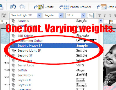
1. Select a font that comes in various weights. I will be using Seabird font which comes in a light weight, a regular weight, and a bold weight. Make your first text box by dragging the text box on your document. Cathy Zielske suggests to "make your long journaling sections into columns. Or make sure your journaling block isn't wider than four inches, five at the most. The rule of thumb should be: the wider the column of your text, the larger your leading should be."
Click on image to enlarge.
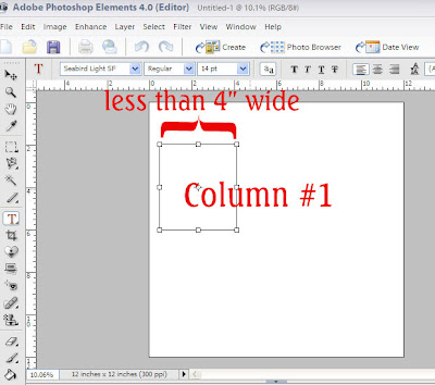
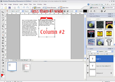
2. Type your text using the light weight in the first journaling box. Then make a second journaling box to the right, and type.
Click on image to enlarge.
3. If you decide that the spacing between the lines is too close, you can adjust it. First, make your text box longer by dragging down on the anchor box.
Click on image to enlarge.
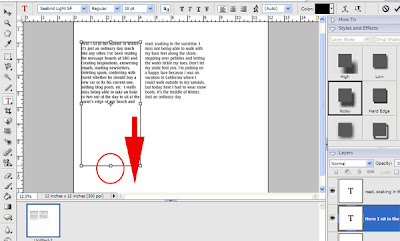
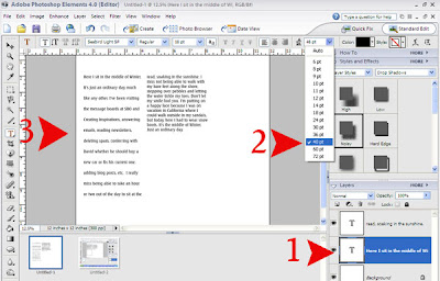
4. Click on the layer of the first text box. Then, click on the leading drop-down box (#2 arrow) and select the number of your choice, I chose 48. You can see the change in leading near arrow #3.
Click on image to enlarge.
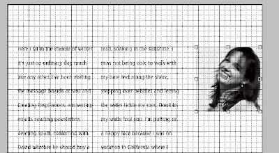
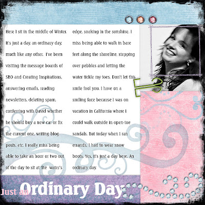
5. You can use the grid to make sure your text boxes are aligned. Add your photo and align.
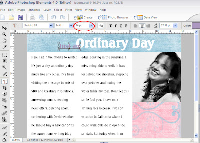
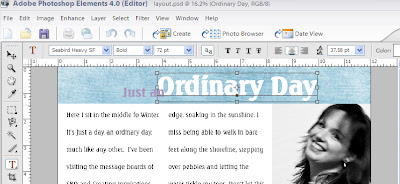
6. Add your title with the Seabird Heavy and Normal Weights. Vary the font size. This layout is created with products from our Sponsor: SaraAmerie.
Click on image to enlarge.
Click on image to enlarge.
7. Embellish as desired. Once I started embellishing, I decided I wanted my title at the bottom of the layout! You're finished!!!
Click on image to enlarge.
 Credits:
All from Sara Amerie Beginning Anew and Brisk Autumns Breeze


9 comments:
Cool tutorial - thanks :)
Another fabulous newsletter! I love reading the wonderful articles and boy, am I learning so much. Keep up the good work!!!
that was great! and no more cramped titles - yay! where is the grid, though? i need that to make my alphas go srtaight ... tfs!
:) M
You can turn on the grid by going to View --> Grid. You can change the grid size by going to Edit -->Preferences --> Grid. I have my grid usually to 1 every 4 subdivisions or 1 every 8 subdivisions depending on what I'm creating. You can also change the color of the grid while you are there.
Wowsers! Great tutorial! I am still at the stage of hmmm...how come I can't make it save after I crop my photo, and what's that straightening thing they were talking about on peas... BUT...I did manage to get a 12" printer so I could have more hybrid abilities!
Hi Ande, perhaps you have to click on the check mark after cropping? It's called the "green commit button". It is located at the bottom right corner of the marquee or press enter to finish cropping. PSE won't let you do anything until you've pressed the green commit button. Let me know if that helps or not.
thedigitalproject@gmail.com
thank you julie! it's so nice to know we can get answers here!
:) M
This tutorial is awesome. VERY helpful -- it will definitely improve my layouts! I love this site! :)
Julie! It worked! I did not know it was a problem with a lack of commitment! LOL Thanks so much for the help, and my pictures thank you too!
Ande
Post a Comment