How To Create Digital Layouts that Look Like Paper Layouts
Giving Digital Layouts that "real" look
As a digital scrapper, one of the most postive comments I can get on my layouts is "it looks so "real" that I had no idea it was a digital layout!" Maybe it's because I was a paper-scrapper first, but that comment always makes me feel great. It's not hard to do with a couple different PhotoShop Elements Tools.
The first step to creating digital layouts that look like paper layouts is to choose digital kits or elements and papers that look realistic, there are so many kits and elements to choose from, from so many different designers, just choose one that you like and get started creating!
I usually create all my layers first, re-size, move things around, add and subtract things to my layout, add any journaling or titles until it is set up the way I think I want it to be. Then I'm ready to add the little details that make your layout pop off the screen.
Adding a drop shadow:
Adding a slight drop shadow will make your papers and elements look like they are actually sitting on the background paper. To add a drop shadow, click on the Layer Styles pallet and click on Low.
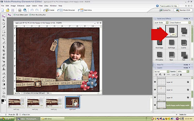
Unfortunately, the default setting in PSE for drop shadows is 21, I tend to use drop shadows that are between 2 and 10 pixels depending on the element, thicker elements (like chipboard) would need a larger shadow, and thinner elements (like paper) need smaller element. To adjust the size of the shadow click on the small f symbol on the layer that you want to adjust and change the size in the dialog box that opens up.
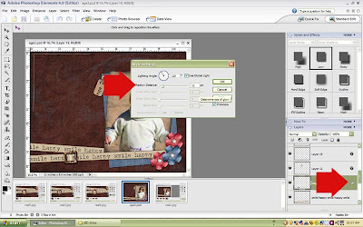
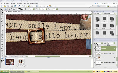
Using the Dodge and Burn Tool to thread a ribbon through a buckle:
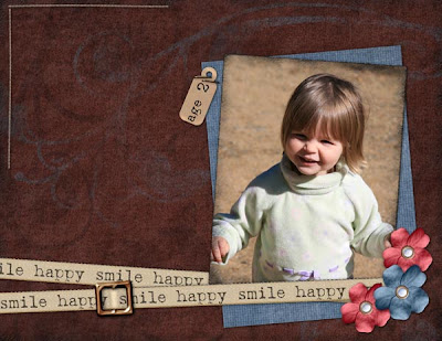
The dodge and Burn tool is such a handy resource for getting your layouts to have real looking shadows. I used it on this layout to thread the ribbon through a buckle.
Place the buckle where you want it to be on your ribbon. and select the section of it that will be "behind" the ribbon, delete that part of the layer.
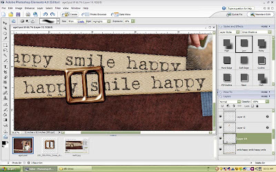
Select the Dodge and Burn tool, it looks like either a small hand, or a circle with a hand. Dodge will lighten an area, and burn will darken it.
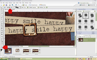
Use a combination of both dodge and burn to highlight and darken the ribbon and the buckle to make it look like the ribbon is threaded through.
Layout Credits:
Papers and digital elements from the "Slightly Shabby" kit by Jill D-Zines at www.scrapoutsidethebox.com
If you enjoyed this tutorial, please reward our designer by leaving a comment. You will also enjoy visiting our sponsors!


4 comments:
Thanks for the great tutorial... I always forget to use my dodge and burn tools!
That is so cool! Thanks for the tutorial -- I'm going to have to give that a try!
Thanks for the tips. I didn't realize I could adjust the shading!
Thanks so much for the great tutorial, I like the burn tools tip !
Post a Comment