How to Create a Pattern for Hand-Cutting Titles: A Hybrid Scrapbooking Tip
Creating a Pattern for Hand-Cutting a Title Using Adobe Photoshop CS2
by Sue Kristoff - Creative Team Member
by Sue Kristoff - Creative Team Member
One way to create a custom title for your layouts is to hand cut the letters. This allows you to use any size letter, any paper and any font with enough weight to hold up to the cutting process. This tutorial will show you how to quickly and easily create a cutting pattern using Adobe Photoshop CS2. I love to handcut my titles because I can create titles that really mesh well with my layout. I don't have to search for die cuts that match, or limit myself to certain sizes.
The first step is to select a font and create your text. I generally start with a 8.5"x11" canvas at 72 dpi. High resolution is not required for this process. It is important to choose a "thick" font. For this tutorial, I used the font Bambi Bold (available free at http://www.dafont.com). The font needs to have enough heft to maintain its shape while you cut it out. When you are creating your text, it is helpful, but not necessary to create your text in a color other than black to facilitate one of the later steps. (Figure 1)

The second step is to rasterize the type. This coverts the letters from text into shapes, which can then be manipulated in ways that text can't. This is done by Layer>Rasterize>Type.
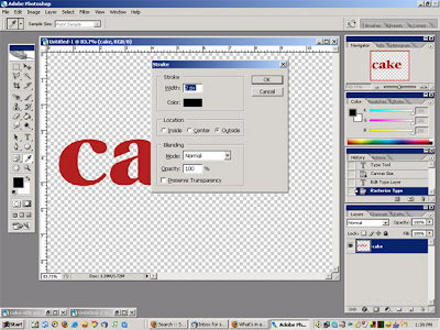
Step Three is to create a stroked outline around the letters. This is done by Edit>Stroke. For a 72 dpi image I set the stroke at 2 pixels, on the outside of the shapes. For higher resolution canvases, increase the stroke width so it remains visible (I use 4 pixels for a 300 dpi canvas). I also change the color to black, so it is easier to see the stroke outline. (Figure 2)
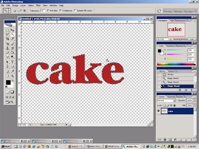
Once you have your stroke outline, Step Four is to use the Magic Wand tool and select each of the letters while holding down the Shift key, until all of the letters are selected. (Figure 3)
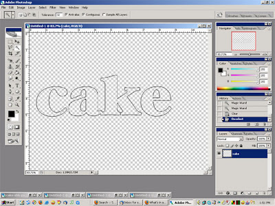
Once they are all selected, hit the Delete key. This will clear the font and leave the stroke outline. While Steps 3 and 4 are not required, it does drastically cut down on the amount of ink or toner required to print your pattern, and if you are using very large, chunky fonts, that could be a lot of ink or toner. (Figure 4)
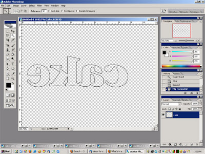
The final step is to flip the text so it is reversed. This is done by Edit>Transform>Flip Horizontal. This step allows you to print directly onto the back of the paper you will be cutting the letters from. You can also print the pattern onto regular paper and adhere it to whatever material you will be cutting the letters from. (Figure 5)
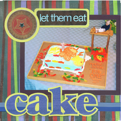
Layout - "Let them eat cake"
Materials:
Patterned paper, tags: Fancy Pants
Paper for title: Provo Craft
Cardstock: Bazzill, Making Memories
Brad, letter stickers: Making Memories
Ribbon: Lil Davis
Font: Bambi Bold (available free at http://www.dafont.com)
Step Three is to create a stroked outline around the letters. This is done by Edit>Stroke. For a 72 dpi image I set the stroke at 2 pixels, on the outside of the shapes. For higher resolution canvases, increase the stroke width so it remains visible (I use 4 pixels for a 300 dpi canvas). I also change the color to black, so it is easier to see the stroke outline. (Figure 2)

Once you have your stroke outline, Step Four is to use the Magic Wand tool and select each of the letters while holding down the Shift key, until all of the letters are selected. (Figure 3)

Once they are all selected, hit the Delete key. This will clear the font and leave the stroke outline. While Steps 3 and 4 are not required, it does drastically cut down on the amount of ink or toner required to print your pattern, and if you are using very large, chunky fonts, that could be a lot of ink or toner. (Figure 4)

The final step is to flip the text so it is reversed. This is done by Edit>Transform>Flip Horizontal. This step allows you to print directly onto the back of the paper you will be cutting the letters from. You can also print the pattern onto regular paper and adhere it to whatever material you will be cutting the letters from. (Figure 5)


Layout - "Let them eat cake"
Materials:
Patterned paper, tags: Fancy Pants
Paper for title: Provo Craft
Cardstock: Bazzill, Making Memories
Brad, letter stickers: Making Memories
Ribbon: Lil Davis
Font: Bambi Bold (available free at http://www.dafont.com)


4 comments:
Hello Julia Ann - I have PSE ver 4 and wondered if there is anyway I can Rasterize or is it just called something else on PSE?
Thank you.
Yes, you can do this with Photoshop Elements. It is the "simplify text" option. If you have your text layer chosen, go to Layer --> Simplify Layer. Note: You will not be able to edit your text to change it once you simplify it.
I am soooo enjoying all of the helpful tips you ladies are providing! Thanks so much!
I was going to ask how to do this in PSE 4, too! :o)
I am trying to do this now and when I go to Layer --> Simplify Layer it isn't doing anything that I can see. ???
Thank you Julie Ann for the pse help!
Post a Comment