Who else wants to be fontalicious?
Martha Treadway, Creative Team member, addresses the issue of what to do when you can't find the right ready-made embellishment. "We've all had designs in mind that we just couldn't find the right element for or didn't want to take the time to shop for. Well using ding-bat fonts can be a HUGE time saver! There's just about any design you could want. They are very customizable as well.
For this page I wanted a large dandelion "blowing" so I opened up my handy dandy program called The Font Thing to get some previews of what I had in my font collection. The ding-bat 60's Chic had a design that reminded me of a fuzzy dandelion so I used that to make the white fuzzy seeds. Very easy. Just pick your color and since I wanted them varied in size I just made duplicates of the same layer and changed the font size
in my toolbar.
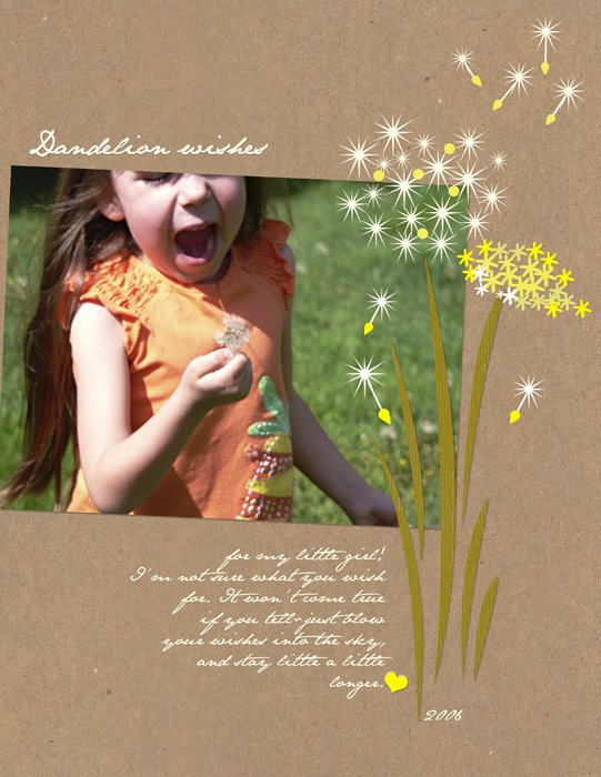
I wanted some yellow in with the white fuzzys so I used a ding bat font called Common Bullets for the yellow circles, again using the same way to resize them. For the seed ends I did use a custom shape found in Photoshop.
Now I decided to do a dandelion in full, yellow bloom so again I turned to The Font Thing to see my different fonts and ding-bats. I found that the journaling font I was using, JaneAusten, had a little astrics included. That was perfect for making my yellow dandelion. Just select the color, try different sizes until you are satisfied then duplicate the layer and change the font size or coloring to your taste.
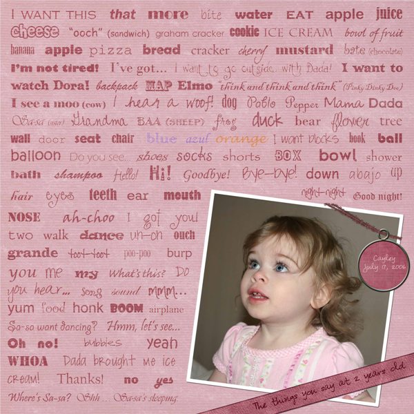 Layout: “The things you say…” by Sarah Meyer, posted with permission
Supplies:
- Paper, ribbon and fiber (slightly recolored) from Michelle Swadling's Primrose kit which can be found here: http://www.digitalfreebies.com/mmstore/product.php?id=1548
- Esprit Special Round tag by Durin Eberhart (slightly recolored) which can be found here: http://www.scrapgirls.com/store/product.php?id=4739&cat
- Sanded overlay by Nancie Rowe Janitz, ScrapArtist
Instructions:
This layout was created in Photoshop CS2. I opened the photo and placed it on top of the paper. I adjusted the hue and saturation of the paper slightly to make it better coordinate with the photo.
I cropped the photo into a square using the rectangular marquee tool with a fixed aspect ratio of 1 to 1. Then I added a layer behind the photo and used the same marquee tool to select a square slightly larger than the photo and filled this with white. I then merged the photo on top of the white square and slightly angled it with the Transform function.
Next I used the pen tool to select the area of the background I wanted text to appear. I defined this selection as a path. With the path and text tool selected I placed the cursor within the selection and the oddly shaped text box was created. I pasted the text into the text box from a word processing program.
I went through the list and changed font of each word and phase to something that seemed to convey its meaning or tone and making sure to mix in the bolder fonts with the lighter curvy fonts. They are all about 30 point in size, but vary according to the font. All the text is black except for the color words. The blue is actually a slightly greenish blue and the orange is really brown. The paragraph is set to Justify Left Last and the line spacing was adjusted to fill the page. I added extra spaces or rearranged words where needed to keep most of the phrases on one line and to maintain an even balance.
Once I was happy with the arrangement I switched the layer blending mode to Overlay. I wanted the text slightly darker than it appeared at 100% opacity so I duplicated the text layer, kept it as an overlay and reduced the opacity of the duplicate overlay to 13%.
I added the sanded overlay on top of the text layer to give it a softer look.
I added in the ribbon to the layout and adjusted its color using the colorize function within the Hue and Saturation adjustment menu. I used the free transform function to angle it at the bottom corner of the page, visually attaching the photo to the page. I noted the angle and when I added the title rotated it the by the same amount.
I added in the tag and fiber and recolored both. I used the Replace Color function to change the paper color of the tag and the colorization method the match the fiber color. I angled the fiber with free transform, selected a segment to wrap around the photo, and created a new layer from this selection. I moved the tag in place and added text. Then I used the transform warp function to bend the ribbon. Then I erased a bit of the fiber to visually thread the tag on.
Lastly I added a drop shadow to the photo, ribbon, tag and fiber. I created a layer from the layer style (drop shadow) and erased a little bit of it where it was on top of the photo so it appears closer there.
Newsletter Subscribers:
If you are signed up for our newsletter, please add thedigitalproject@gmail.com to your address book so that the newsletter does not go to your Spam folder. (You may unsubscribe from the newsletter at any time.) If you are not signed up and would like to do so to receive our very first installment, please sign up right here.
Thank you very much!
Update: I forgot to mention that the newsletter will have new content that you haven't seen here on the blog! Look for a fun interview! Thanks!
Keywords: Designing with Fonts, Adobe Photoshop, Advanced, Brush - Brushes, CS2, Digital Image Pro DIP, Featured Reader, Paintshop Pro, Photoshop Elements PSE, PS7, Resources, Custom


5 comments:
Just gorgeous!!! I love this layout! It's so creative how you included all of her words at 2 years old! Thank you for sharing this information.
Julia L. (So. California)
yay Sarah! Great description of your LO!
I love this! What a creative way to use so many of the things that Cayley can say. Your description of how you did this is great ... very easy to follow, even for a relative beginner like me! Thanks!!
Sarah, I love this layout! And a head's up...I'm going to use it when X-man has a bigger vocabulary than mamamamamamama!
very creative LO idea, Sarah.
Julie, I really love the dandelion page, wonderfully simple. I'm wondering about the drop shadows you use on the photo and some? all? of the elements. I use PSE, and the drop shadow seems so extreme to me. Is it a program difference, or do you do something else that makes the shadow seem so subtle?
Post a Comment