Beginner's Guide to Drop Shadows
Demystifying Drop Shadows :
A Beginner Tutorial
for Digital Scrapbooking

By Michele Ciola, Creative Team Member
Featuring Sponsor Scrapkit.nl
A Beginner Tutorial
for Digital Scrapbooking
By Michele Ciola, Creative Team Member
Featuring Sponsor Scrapkit.nl
I think one of the hardest things for a new digital scrapper to get the hang of is creating realistic drop shadows. Drop shadows can really enhance the look of your elements and they can certainly make layers look more realistic. If you are among the many who find it very difficult to achieve that perfect drop shadow, then read on! Don’t you worry. Follow this tutorial and you will become a drop shadow master in no time!
Drop shadows really are a personal preference. For me, I like the more subtle drop shadows. Others lprefer darker and wider shadows. No matter what your preference, here are a few quick and easy tricks that will make drop shadowing a breeze!
Once you have your layout or item open in Photoshop CS2, click on the layer you would like to add your drop shadow to. This could be a paper layer, an element such as a brad or even a strip of ribbon. Whatever the layer is you choose, simply make sure it is selected in the layers palette.
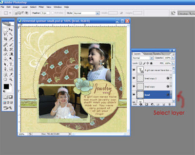
Next click on Layer - Layer Style - Drop Shadow
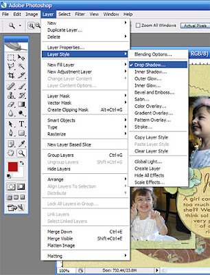
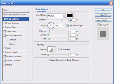
Your dialog box should look similar to the default set up below. The most important step in creating a realistic drop shadow is to change the color of the drop shadow itself to a more subtle grey color. You can experiment here with various shades. To change the color simply, click on the Blending Mode box color which is circled in red below.
This will bring up the color picker dialogue box. You can select various colors and shades here for your customized drop shadow color or you can type in a hex color code below in the # field.
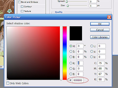
To use a more subtle grey color, simply type in a hex code value of: a9a7a7 and then click ok. Next, all you need to do is change a few more settings and you almost done!
I would also recommend taking the opacity down to around 75% along with using 120 degree angle. The opacity change gives the drop shadow a more a bit of a fuzzy more muted appearance. The angle change will direct the light so that it casts a shadow concentrating on the bottom right corner of your object. I really like this angle when using drop shadows.
I also set my distance to 2, spread to 0, and Size to 2 as well but you can experiment with different settings until you come up with your own personal preference. The dialogue box should then look like the one below after you have changed all of your settings.
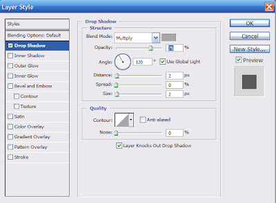
Simply click OK and there you have it! Perfect drop shadowing every time!
Try these settings the next time you need a drop shadow. I’ve attached 2 examples for you below. One without drop shadows and the other with the drop shadow technique I’ve highlighted here for you.
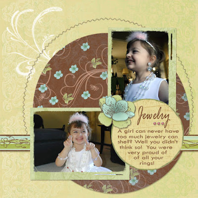

Even though the changes are subtle, they make a big impact in creating a realistic feel to your layouts!
I hope you’ve enjoyed this tutorial. Now go out there and create fabulous drop shadows!!! Can’t wait to see what you come up with!!
(If you learned something, please leave a comment for Michele!)


2 comments:
Hi there,
Nice stuff you got, fabulous pics.
Well, I do have also in my sleeves, if you have time don't forget to visit
photosorcery.com
Many thanks
Gorgeous layout Michelle!
Post a Comment