Friday, March 16, 2007

Discover How to Create Journaling Columns In Photoshop Elements

Creating Columns for Journaling

Scrapbook Tutorial

by Julie Ann Shahin, Creative Team Member
Profile photo for Julie Ann Shahin, Founder

Do you have a big story you want to tell? Do you want to prevent your user from getting a headache? Follow these tips to create easier readibility.
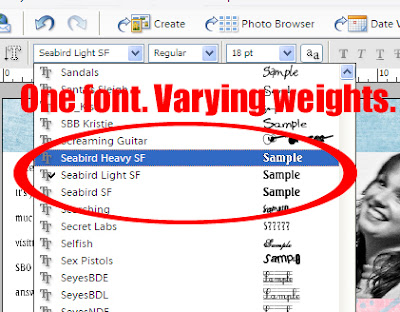
Screenshot of Seabird fonts by Julie Ann Shahin for Everyday Digital Scrapbooking
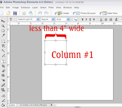
1. Select a font that comes in various weights. I will be using Seabird font which comes in a light weight, a regular weight, and a bold weight. Make your first text box by dragging the text box on your document. Cathy Zielske suggests to "make your long journaling sections into columns. Or make sure your journaling block isn't wider than four inches, five at the most. The rule of thumb should be: the wider the column of your text, the larger your leading should be."
Click on image to enlarge.
Screenshot of Column #1 by Julie Ann Shahin for Everyday Digital Scrapbooking


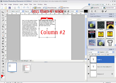
2. Type your text using the light weight in the first journaling box. Then make a second journaling box to the right, and type.
Click on image to enlarge.
Screenshot of Column #2 by Julie Ann Shahin for Everyday Digital Scrapbooking

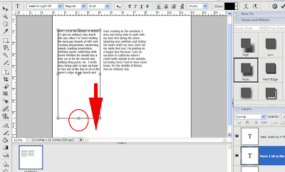
3. If you decide that the spacing between the lines is too close, you can adjust it. First, make your text box longer by dragging down on the anchor box.
Click on image to enlarge.
Screenshot of Adjusting Text Box by Julie Ann Shahin for Everyday Digital Scrapbooking


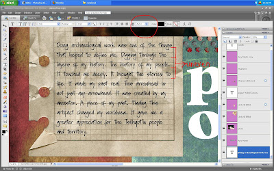
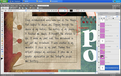
4. Click on the layer of the first text box. Then, click on the leading drop-down box (#2 arrow) and select the number of your choice, I chose 48. You can see the change in leading near arrow #3.
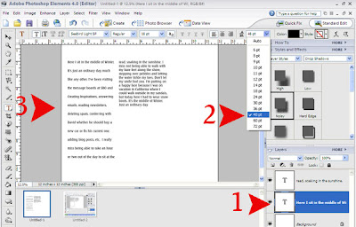
Click on image to enlarge.
Screenshot by Julie Ann Shahin for Everyday Digital Scrapbooking


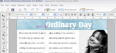
5. You can use the grid to make sure your text boxes are aligned. Add your photo and align.
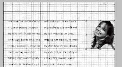
Screenshot of Text Boxes with Grid by Julie Ann Shahin for Everyday Digital Scrapbooking


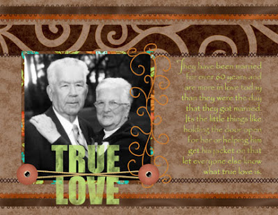
6. Add your title with the Seabird Heavy and Normal Weights. Vary the font size. This layout is created with products from our Sponsor: SaraAmerie.
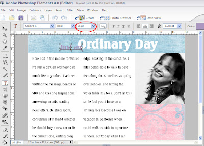
Click on image to enlarge.
Screenshot of Title Fonts by Julie Ann Shahin for Everyday Digital Scrapbooking


Click on image to enlarge.
Screenshot of Title Fonts by Julie Ann Shahin for Everyday Digital Scrapbooking


7. Embellish as desired. Once I started embellishing, I decided I wanted my title at the bottom of the layout! You're finished!!!
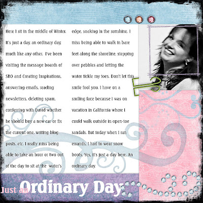
Click on image to enlarge.
Layout by Julie Ann Shahin for Everyday Digital ScrapbookingCredits:
All from Sara Amerie Beginning Anew and Brisk Autumns Breeze


Thursday, March 15, 2007

First 500 Subscribers Get Free Digital Kit!!!

http://scrapbookdimensions.com/shoppe/ promo

Special Offer to the next 500 subscribers! Get this Bonus Offer free with your magazine subscription (a $25.00 value!)


Learn how you are probably already incorporating some type of combination of traditional and digital scrapbooking techniques in your scrapbooking layouts and projects. Each issue contains the following and more...

* Step by Step Instructions
* Innovative and easy techniques to learn
* Inspiring Reader's Gallery with descriptions of techniques used
* Getting Organized Tips
* Photography Know-How
* And lots more!

Get a FULL YEAR (6 issues) of Scrapbook Dimensions Magazine for only $19.99 - a savings of 54% off the cover price!


How to Create Shaped Journaling for Scrapbooking

Scrapbook Layout with text in a shape by Maggie Lamarre for Everyday Digital Scrapbooking

Using Illustrator and Paint Shop Pro to Create Shaped Text
Digital Scrapbooking Tutorial by
Maggie Lamarre, Creative Team Member
Profile Photo of Maggie Lamarre, Creative Team Member
Supplies used
Irresistible kit from Oscraps.com
Leaves from the Element brushes from Dragonflaire.com

I am currently reading Designing for the Nondesigner by Robin Williams.
This book emphasize the use of font and placement.
The study of typography to convey mood and balance.

I wanted to convey a fun atmosphere and show fun on the lo, I use a vibrant colour of Coral and subdued mocha to balance it. Journaling on your lay out doesn't have to be a square. You can use shapes such as Arrows, stars, brackes etc..

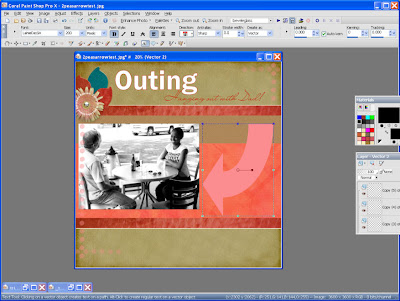
For this Lo in my graphic software I have a fun arrow but it didn't bend as the shape I wanted to be.

I imported the shape into Illustrator did a live trace, expand, then select object and simplify and adjust the shape to my liking.

Once done the next step is I imported the shape into Paintshoppro as a bezier.
Paint Shop Pro screen shot by Maggie Lamarre for Everyday Digital Scrapbooking


Then select the type tool, selected the font and size then type the journaling.
Once done turn off the shape and Voila very easy.
Have fun
Creat your ART.
Maggie
PS We would love to see what type of shape you come up with :)

Mlamarre


Wednesday, March 14, 2007

Step-by-Step Tutorial with Screenshots for Adjusting Leading

Layout created by Cammy Plummer for Everyday Digital Scrapbooking

Design Secrets: Layouts Showcasing

the Use of Text with Leading, Spacing, Columns

by Cammy Plummer, Creative Team Member
Profile of Cammy Plummer, Creative Team Member


Instructions:
1. Select background and layer elements in the following order, from the bottom up: paper square and torn paper strip, ribbon, note paper, photo, torn paper corner, tag, and tag embellishments.
Click on image to enlarge please
Screen shot for text tutorial by Cammy Plummer, Creative Team Member
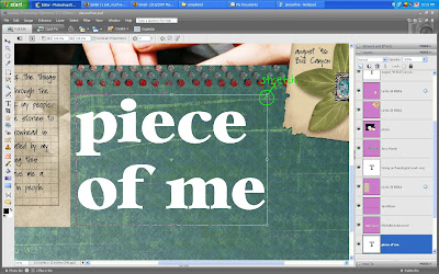
2. Add title. I usually set aside a specific space for my title, so I adjust the font size and leading (the space between lines) to fit.
Click on image to enlarge please
Screen shot for text tutorial by Cammy Plummer, Creative Team Member
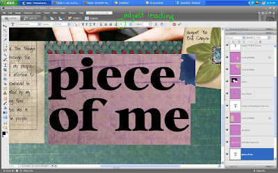
3. Write journaling in a font size that is appropriate for the space and font type. For a 12x12 layout, I do not recommend using a font size smaller than 12 point, unless you want your journaling to be difficult to read for the sake of privacy. Adjust the leading to fit the lines on your note paper. Note that you can use a decimal to get the leading right.
Click on image to enlarge please
Screen shot for text tutorial by Cammy Plummer, Creative Team Member
4. Add drop shadows and the date and you are finished!
Screen shot for text tutorial by Cammy Plummer, Creative Team Member


Credits:
Paper and leaf embellishment: MLamarre, The Botanical Collection, Oscraps
Note paper and tag: Linda Gil Billdal, Stationeries Revamped, Scrap Artist
Corner tear: Linda Gil Billdal, Cardboard Flip and Tear, Scrap Artist
Ribbon: Jen Wilson, Meaning 4, Jen Wilson Designs (stamped dots); Michelle
Underwood, Random Thoughts 3, Scrapbook-Bytes (measuring tape); Amy Martin,
Stitched Folded Bundle 1
Paper tear:Stephanie Krush, 2005-Straights, Digital Paper Tearing
Actions: Traci Murphy, Drop Shadows, Traci Murphy Designs
Fonts: Bambi Bold; Soli


Tuesday, March 13, 2007

A Quick Tip for Great Text Formatting

Text - "Leading" Quick Tip
by Amy Duquette, Creative Team Member


Profile photo of Amy Duquette, Creative Team Member

From about.com
Definition: Leading is the space between lines of type. It is generally measured from baseline to baseline and expressed in points. The name leading is derived from the days of hot metal type when strips of lead were placed between lines of type to provide line spacing.

Pronounciation: ledding

Also Known As: line spacing

Related Resources:

Basic Typography
Explore the use of type in desktop publishing.

Often we are faced with the problem of having a large space to fill up or we have a small area to fit our journalling in and it seems pretty impossible to fit text in. Well a simple solution to those problems is adjusting the "Leading" in your text. Leading is the space between two lines of text. Photoshop has a nice leading tool that allows you to play around with the leading until you are happy with the result.

Screenshot of leading example in Photoshop by Amy Duquette, Creative Team Member

  • It is a good rule of thumb to keep your font size and your leading around the same number.
  • If you need to fill up some space without increasing the size of your text you can increase the leading like I did in the example below.
  • I wanted to balance out my photo with my journalling. Also try experimenting with different fonts because not all of them are the same. 72dpi for one font may be huge but for another it could be just right. Experimenting is a HUGE plus because if you mess up you can just delete that layer or undo what you just did without ruining anything.
Layout created by Amy Duquette for Everyday Digital Scrapbooking
So have fun with your text and think outside of the box! If you are enjoying our tutorials, sign up for our weekly newsletter!


Monday, March 12, 2007

Tips for Designing with Text Paths

This week our goal is to bring you more design secrets: all about text! Check back all week for more tips and techniques.
Design Secrets: Text on a Path

by Angela Spangler, Creative Team Member

Profile Photo of Angela Spangler, Creative Team Member

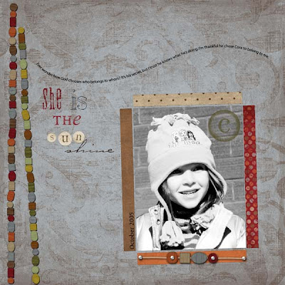
Don't you just love when a layout comes together? Since scrapbooking is a highly personal hobby, I love to design layouts according to my tastes and style. You should do the same!

Layout created by Angela Spangler for Everyday Digital Scrapbooking

In this particular layout, I used the swirled text to flow across the page. Since the text ends above the photo, it draws the eye to the photo as you're reading.
  • Experiment with different ways of placing your text, as it can be a unique embellishment to your layout.
  • Have your text flow around the photo or
  • along the edges of the layout.
It's a simple but effective technique for showcasing a photo without adding a bunch of "bling" to your page.

Credits:
Paper, beads, Sun alpha from Fee Jardine's "Vintage Pickle" kit at www.thedigichick.com
"C" stamp from " Cherry Blossom kit at The Digi Chick
Text path: Jen Caputo at The Digi Shoppe
Fonts: DSP Pollyanna; OliJo; Carpenter; Will and Grace; Witchcraft

Related Tutorials:

Text on a Path in Photoshop CS

Text on a Spiral Path in Photoshop CS

Graffi's Video Tutorial: A quick and easy technique for making your text elements follow a line, circle, square, or any other path you can draw in Photoshop.
This is part 1 of a 5-part series on multi-use graphics created with Photoshop or Elements


If you feel inspired by today's tips, please leave a comment for our designer! Thank you.