How to Create Personal Stationary Using Digital Products
In this day and age many of us had family and friends in different states, or even (like me) countries, and even though sending the occasional email is great it is still nice to receive letters in the mail, or by snail mail as it's called these days! One of the things I do is send a letter periodically to family and friends back home in England. It really doesn't take long to type up (or handwrite) a letter and pop it in the mailbox, and if it's the recipients birthday or a holiday you can send a card too!
In this basic tutorial we'll make a letterhead for use in a word processing program.
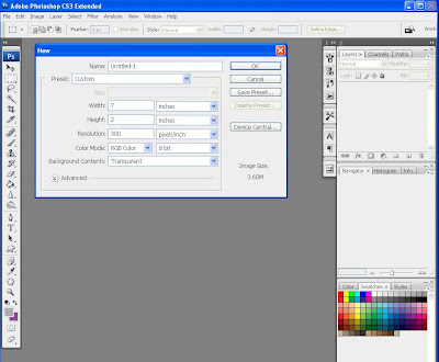
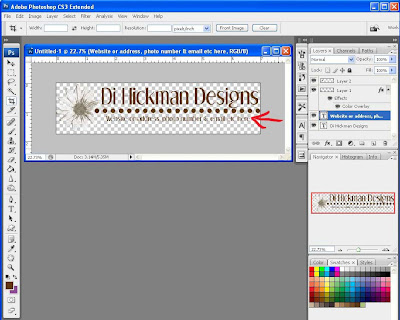
- First open a new document in photoshop, my preference for these is 7 inches x 2 inches (remember to account for your margins in your word program), having the image narrower than the letter size page means the page looks more uniform.
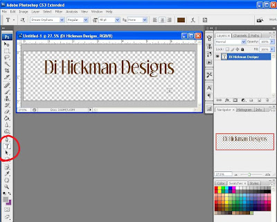
- Using the text tool, chose the font and color you wish to use and type your header. For this example I kept it the same font and colors as my blog.
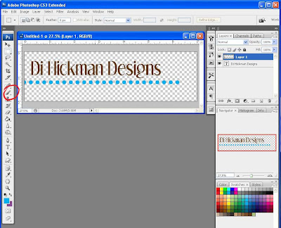
- In keeping with my blog I wanted the row of dots, I did this by choosing a round brush and altering the spacing to 150%
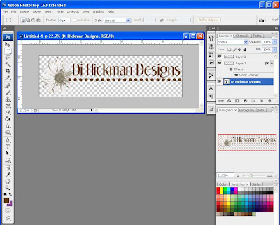
- Open an image you wish to use, this is a flower I created, I used this on my business cards so having it on the letterhead also ensures continuity.
- You can see here too that I changed the dots to brown instead of the turquoise. I did this by adding a layer style> color overlay, and choosing a brown. Simple way to instantly change the color without having to bucket fill each dot!
- I also changed the alignment, moving things around till I was happy with a design.
- Underneath the dots I could add my address, website address, phone number, email or a tagline.
- Imagine the main header said "Merry Christmas", the tagline could read "and a happy New Year".
- This is where you save your image as a jpg file.
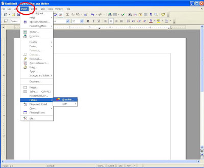
- To use the jpg in a word processing document, here I use Open Office (http://www.openoffice.org/), a free download word processing program.
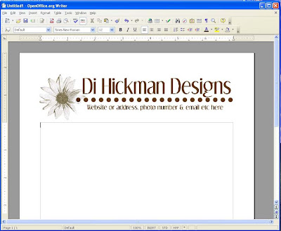
- Simply: insert>picture , you'll may need to move it around a little, and you can resize it should you need to.
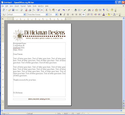
- I changed my side margins to 3/4", just my personal preference and my top margin I made 2 1/2 inches to allow for the header.
- You can choose to add a footer with either your address or tag line or website url.
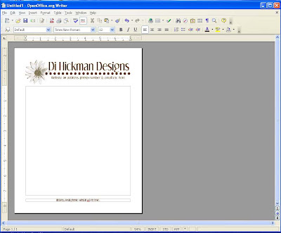
- You can see an example page filled out below.
- You could get real fancy with digital designs but remember that the more colors you put in the more ink you are going to use when printing! This could really add up if you are printing off 100 Holiday letters for family and friends.
- Imagine the possibilities for your Christmas letters, thank you letters, baby announcements, achievements and more!
Please let Di know what you think of this free tutorial she has provided! Thanks!!!
Be sure to be signed up for our newsletter to get your free REALLY BIG digital kit created by the EDS Creative Team for our big birthday bash October 1st - 5th!!! Look for it in the newsletter on October 7th and celebrate with us!
Be sure to be signed up for our newsletter to get your free REALLY BIG digital kit created by the EDS Creative Team for our big birthday bash October 1st - 5th!!! Look for it in the newsletter on October 7th and celebrate with us!


2 comments:
Thank you for the tutorial. I've never used Color Overlay - never thought I needed to. Your comment gave me one of those ah-ha moments. Now I can't wait to play with Color Overlay!
This blog post is really great; the standard stuff of the post is genuinely amazing.http://thedigitalproductblueprint.com
Post a Comment